Best Time to Visit Rara Lake (2026): Month-by-Month Weather, Rainfall, Crowds & Access Guide
Best Time to Visit Rara Lake (2026): Month-by-Month Weather, Rainfall, Crowds & Access Guide
Updated October 2026 · Climate figures from FAO and JICA records for the Rara area · Fees from the Rara National Park Office · All heights in feet
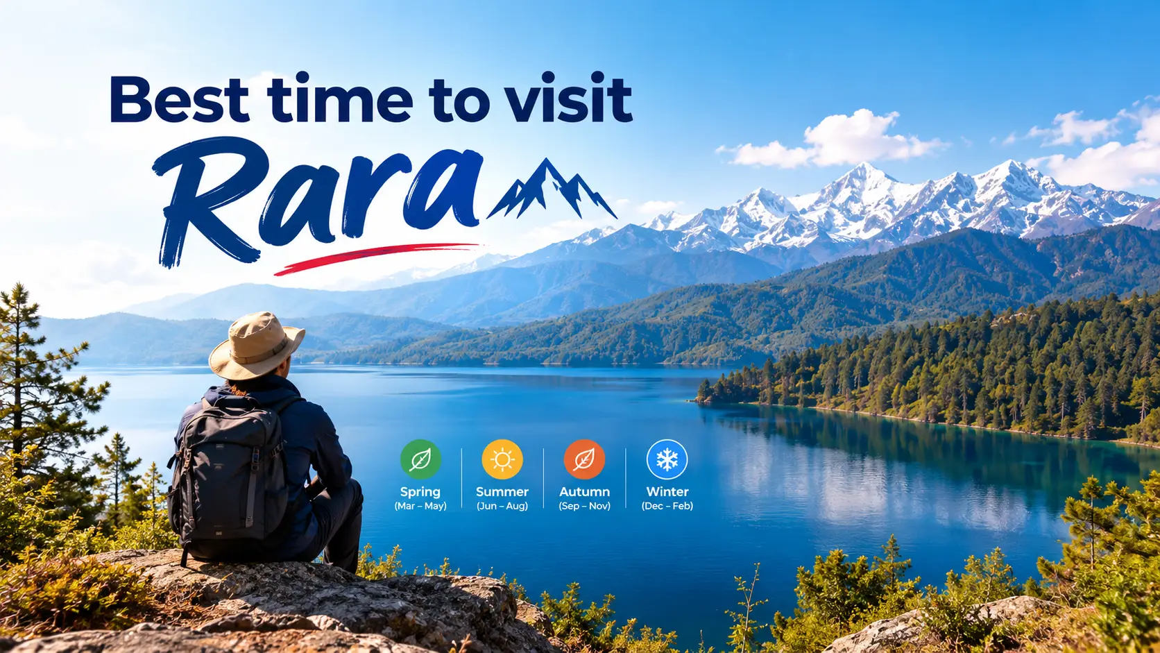
Rara Lake is the kind of place you only get to once or twice in a lifetime, so the month you pick matters more than almost anything else. Nepal’s largest lake sits at 9,810 ft in remote Mugu, a long flight-and-walk or a two-to-three-day drive from Kathmandu. Get the season right and you get glassy blue water, clear Himalayan skylines and flights that leave on time. Get it wrong and you can spend days waiting in Nepalgunj for a plane, or sliding along a muddy Karnali Highway.
Most guides simply say “spring and autumn.” This one goes further: real monthly temperature and rainfall data, the best month for your kind of trip, when the Dashain–Tihar crowds arrive, how each season changes the journey there, and the 2026 park fees.
Quick answer: when is the best time to visit Rara?
The best time to visit Rara Lake is October to mid-November, when the monsoon has cleared, the sky is at its sharpest and November is the driest month of the year. The second-best window is March to May, with April the pick for warm days and rhododendron forests.
Avoid July and August (the wettest months, with landslide-prone roads and delayed flights). December to February is only for well-prepared winter travellers, as nights drop below freezing and snow can block the trails.
Rara Lake at a Glance
In this guide
Rara Lake Travel Calendar at a Glance
Here is the whole year in one strip. Green months are the safest bets for weather, views and flights; red months are the ones most travellers should skip.
Dark green = best · green = good · yellow = possible with flexibility · red = avoid · blue-grey = winter, for prepared travellers only. Rara National Park itself names March, April and October–November as the best months.
Rara Lake Weather by Month: Temperature and Rainfall
Most articles on this topic guess at temperatures. The figures below come from long-term climate records for the Rara area (station at about 10,000 ft) compiled by the UN Food and Agriculture Organization and Japan’s JICA. They are averages, so a cold snap or a late monsoon can still surprise you, but they show the real shape of the year.
Daily temperature range at Rara (average low to average high)
Feb
Mar
Apr
May
Jun
Jul
Aug
Sep
Oct
Nov
Dec
Each bar runs from the average night-time low to the average daytime high, on a scale from 23°F (−5°C) at the bottom to 77°F (25°C) at the top. Bars that start near the baseline (December–February) mean nights below freezing. Exact numbers are in the table below.
Average monthly rainfall at Rara (inches)
Source: FAO agroclimatic data and JICA records (via Wikipedia’s Rara Lake climate table). Notice the cliff between September (4.2 in) and October (1.2 in) – that drop is the whole reason October is the best month.
Rara Lake month-by-month table
| Month | Avg high | Avg low | Rain | Verdict |
|---|---|---|---|---|
| January | 46°F (7.5°C) | 28°F (−2.3°C) | 1.2 in | Coldest month; snow on trails |
| February | 49°F (9.3°C) | 29°F (−1.5°C) | 1.7 in | Winter only; snowfall still possible |
| March | 57°F (13.6°C) | 37°F (2.9°C) | 2.0 in | Good; snow melting, quiet trails |
| April | 66°F (18.8°C) | 39°F (3.7°C) | 1.7 in | Best spring month |
| May | 70°F (21.0°C) | 43°F (6.0°C) | 2.7 in | Very good; afternoon cloud builds |
| June | 71°F (21.6°C) | 49°F (9.5°C) | 3.2 in | Fair early; monsoon arrives |
| July | 66°F (18.7°C) | 51°F (10.3°C) | 7.6 in | Avoid; landslides, flight delays |
| August | 66°F (18.6°C) | 50°F (10.1°C) | 8.2 in | Avoid; wettest month |
| September | 65°F (18.1°C) | 47°F (8.5°C) | 4.2 in | Go late in the month; very green |
| October | 60°F (15.8°C) | 39°F (4.0°C) | 1.2 in | Best month overall |
| November | 50°F (10.1°C) | 32°F (0.2°C) | 0.3 in | Excellent; driest, frosty nights |
| December | 46°F (8.0°C) | 29°F (−1.5°C) | 0.9 in | Clear but freezing; snow later |
Rara Lake Season by Season
Autumn (September–November): the best time to visit Rara
Autumn wins because of one number: rainfall falls from about 4.2 inches in September to 1.2 in October and just 0.3 in November. That means:
- Clear skies and still water – the lake’s famous shifting blues are sharpest, and the snow peaks to the north show up behind the pine ridges.
- Reliable flights – the small planes into Talcha fly by sight, and autumn has the fewest weather cancellations.
- Dry roads – the Karnali Highway and the Nagma–Gamgadhi road are at their most usable after the monsoon.
- Comfortable walking – daytime highs of 50–60°F, ideal for the hike up Murma Top.
The catch: autumn is also when Nepal celebrates Dashain and Tihar, so lodges around the lake fill with domestic travellers during the holiday weeks (more on that below). And by late November, nights drop to freezing – pack a proper down jacket.
Spring (March–May): flowers, warmth and long days
Spring is the strong second choice and, for many people, the more beautiful one. Snow retreats from the ridges in March, rhododendrons colour the forests through April, and May brings the warmest dry days of the year at around 70°F.
- March: crisp, quiet and cheap; patches of snow may linger on higher trails.
- April: the sweet spot – warm days, only about 1.7 inches of rain, and the best flower displays.
- May: warmest and good for boating and camping, but haze and afternoon clouds start to soften the mountain views before the monsoon.
Monsoon (June–August): green, empty and risky
July and August together bring roughly 16 inches of rain – nearly half of Rara’s annual total of about 35 inches. The meadows are at their greenest and you will have the lakeshore almost to yourself, but:
- Landslides can block the Karnali Highway for days.
- Flights to Talcha and Jumla are often delayed or cancelled by cloud.
- Trails turn muddy, and leeches appear in the lower forests.
- The mountains are usually hidden behind cloud.
If you can only travel in summer, early June is the least bad option. Build in at least three spare days.
Winter (December–February): snow, silence and frozen nights
Winter turns Rara into a postcard of snow-covered pines, and it is the season when migratory waterfowl such as mallard, gadwall, tufted duck and common goldeneye shelter on the lake. But average lows sit below freezing from December to February, heavy snowfall can block the approach trails and roads, and many small lodges close or run on minimal service.
Does Rara Lake freeze in winter?
Sources disagree, and most guides don’t mention it. Some reference listings describe the lake as frozen from December to March, while other travel writers say it never freezes. The likely truth sits in between: with a maximum depth of about 548 ft, the main basin is very unlikely to freeze solid, but ice can form along the shoreline and in shallow bays during the coldest weeks. Don’t plan a winter trip expecting either open boating or a skateable lake – check with lodges in Mugu before you go.
Best Month to Visit Rara for Your Type of Trip
“Best” depends on what you want from Rara. Find your row:
October–early November. Driest air, calm mornings for reflections, and clear peaks behind the lake.
April or October. Dry trails over the high ridges and comfortable walking temperatures.
April–May. The warmest dry months make boating and lakeside walks easiest for kids and older travellers.
November and March. Migratory waterfowl arrive for winter and pass through on spring migration, without deep-winter cold.
Early March or late November. Good weather, but outside the Dashain–Tihar holiday rush.
Late December–January. Only with a guide, winter gear and flexible dates; the journey may take far longer.
Crowds at Rara: The Dashain–Tihar Rush
Rara is busier than its “remote” reputation suggests – and almost all of the visitors are Nepali. According to the Rara National Park Office, as reported by The Rising Nepal in September 2026, the lake received 24,931 visitors in fiscal year 2025/26, up from 20,191 the year before.
Who visited Rara Lake in FY 2025/26
Source: Rara National Park Office. Total visitors grew about 23% year on year.
Because domestic tourists dominate, Rara’s crowd calendar follows Nepal’s holidays rather than the international trekking season. The big spike comes during the long Dashain and Tihar break in October–November, when families and student groups drive in along the Karnali Highway and lakeside lodges and Talcha flights sell out.
Local tip: beat the festival crowd
If you want October weather without October crowds, aim for the week just before Dashain’s main days or the gap between Dashain and Tihar, or go in the second half of November after Tihar. Book Nepalgunj–Talcha seats and lakeside rooms early for any holiday week, and expect road transport from Surkhet to be packed with people heading home.
How the Season Changes Getting to Rara
Timing matters as much for the journey as for the lake. There are two main ways in, and the weather hits them differently.
Routes to Rara Lake (schematic)
By air (fastest)
Kathmandu
↓ about 1 hour flight
Nepalgunj
↓ about 30–40 min on a small plane
Talcha Airport, Mugu
↓ roughly 2–4 hours on foot, or a short jeep ride plus a walk
Rara Lake · 9,810 ft
By road (cheapest)
Kathmandu
↓ around 13–15 hours
Surkhet
↓ Karnali Highway via Kalikot
Nagma (Jumla)
↓ Nagma–Gamgadhi road past Talcha
Rara Lake · usually 2–3 days in total
Schematic, not to scale. Trekkers can also fly to Jumla and walk to Rara over several days.
| Season | Flights to Talcha | Road via Karnali Highway |
|---|---|---|
| Autumn | Most reliable; book ahead in festival weeks | Best condition of the year; busy at festivals |
| Spring | Reliable; occasional afternoon cloud | Good; dusty stretches |
| Monsoon | Frequent delays and cancellations | Muddy; landslide blockages common |
| Winter | Clear days fly; fog and snow cause delays | Dusty, icy; high sections can close after snow |
Visitors who drive in have long complained that the roads to Rara turn to mud in the monsoon and to dust in winter – another reason spring and autumn are the easiest seasons. If you are flying into Nepal from abroad, our complete guide to traveling to Nepal covers visas, SIM cards, insurance and domestic flights before you head west.
Rara National Park Permits and Fees (2026)
Rara Lake lies inside Rara National Park, Nepal’s smallest national park at about 41 square miles. It was established in 1976, and the lake and its surrounding wetland were listed as a Ramsar site in 2007. Every visitor needs a park entry permit.
| Fee | Amount per person |
|---|---|
| Entry – Nepali citizens | NPR 100 |
| Entry – SAARC nationals | NPR 1,500 |
| Entry – other foreigners | NPR 3,000 |
| Boating on Rara Lake | NPR 500 |
Source: Rara National Park Office regulations, reported September 2026. Entry permits are single-entry and non-refundable. Drone use needs a separate filming permit.
Part of the boating fee goes to the boat operators and the Buffer Zone Development Committee, so it directly supports local communities. Foreign trekkers should also check with a registered agency whether Nepal’s licensed-guide requirement for national parks applies to their route, as rules have changed several times since 2023.
What to Pack for Rara by Season
Every season
- Broken-in hiking boots
- Warm layer – nights are cool all year
- Sunscreen, sunglasses, hat (strong sun at 9,810 ft)
- Water filter or purification tablets
- Cash in rupees – no reliable ATMs near the lake
- Power bank and offline maps
Autumn & winter add
- Down jacket for sub-freezing nights
- Thermal base layers, gloves, warm hat
- Sleeping bag rated to about 14°F (−10°C) in winter
- Microspikes for icy trails (Dec–Feb)
Spring & monsoon add
- Waterproof jacket and pack cover
- Quick-dry clothing
- Leech socks and salt (Jun–Aug)
- Spare days in your schedule
What Most Rara Lake Guides Don’t Tell You
- November is actually drier than October. Long-term records put November rain at about 0.3 inches – the driest month of the year. If you can handle frosty nights, mid-November can beat October.
- The crowds are Nepali, not foreign. Fewer than 330 of nearly 25,000 visitors last year came from abroad. Rara’s busy weeks follow Nepali school and festival holidays.
- Early September is still monsoon. September averages over 4 inches of rain; most of it falls in the first half. “Autumn” at Rara really starts in the last week of September.
- Spring has a haze problem by May. April gives you the flowers with clearer views; May is warmer but hazier.
- Your bottleneck is Nepalgunj, not the lake. Talcha flights are short, small and weather-dependent. Keep at least one spare day on the way in and one on the way out, in any season.
- Mobile coverage is limited. Signal is patchy around the lake; NTC generally reaches further into remote hills than other networks. See our telecom and internet in Nepal guides before you go.
- Rara is a protected wetland. Overgrazing and festival-season litter are real problems here. Carry your rubbish out – especially in the busy Dashain–Tihar weeks.
Things to do at Rara in good weather
Walk the roughly 8.7-mile shoreline loop through pine, spruce and juniper forest; take a boat out on the lake; hike to Murma Top (around 12,000 ft) at sunrise for the classic view of the whole lake; look for musk deer and red panda in the forests; and visit the Rara Mahadev and Chhapru Mahadev shrines. Rara is also home to its own endemic fish, the Rara snowtrout – another reason the lake is protected. For the wider picture of Nepal’s lakes, rivers and forests, see our guide to the natural resources of Nepal.
Frequently Asked Questions About the Best Time to Visit Rara
What is the best time to visit Rara Lake?
October to mid-November is the best time, with dry weather, clear skies and the most reliable flights. March to May, especially April, is the second-best window.
Which is the best month to visit Rara?
October. Rainfall drops to about 1.2 inches after September’s 4.2, daytime highs are around 60°F, and mountain views are at their clearest. April is the best spring month.
Can I visit Rara Lake in the monsoon?
You can, but July and August are the wettest months, with around 8 inches of rain each. Expect landslides on the roads, delayed flights and cloudy views, and keep several spare days.
Is it possible to visit Rara Lake in winter?
Yes, for prepared travellers. Average lows fall below freezing from December to February and snow can block trails, but the snowy scenery and winter birdlife are spectacular. Go with a guide and warm gear.
How cold is Rara Lake in October?
Average highs are about 60°F (16°C) and lows about 39°F (4°C). Nights get colder towards the end of the month, so bring a warm jacket.
When is Rara Lake most crowded?
During the Dashain and Tihar holidays in October–November, when domestic tourists arrive in large numbers. Book flights and lodges early for those weeks.
How many days do I need for Rara Lake?
Plan at least 5–7 days from Kathmandu if flying via Nepalgunj and Talcha, including spare days for weather. By road, or trekking from Jumla, allow 10 days or more.
What is the entry fee for Rara National Park?
NPR 100 for Nepali citizens, NPR 1,500 for SAARC nationals and NPR 3,000 for other foreigners. Boating costs NPR 500 per person.
The bottom line
If you can choose any time, go to Rara in October or the first half of November – and dodge the Dashain–Tihar holiday weeks if you want the lakeshore quieter. If autumn won’t work, April is a beautiful alternative. Whatever the month, keep spare days for Talcha flights, carry warm layers for cold nights, and leave the lake as clean as you found it.
Sources: FAO and JICA climate records for Rara (via Wikipedia’s Rara Lake page); Rara National Park Office figures reported by The Rising Nepal; Department of National Parks and Wildlife Conservation Rara National Park brochure.